Sacred Profane
Client
Sacred Profane Brewery and Tankpub
Service
Branding, Package Design, Merch, Interior Signage
Location
Biddeford, ME
With great constraint comes great possibilities.
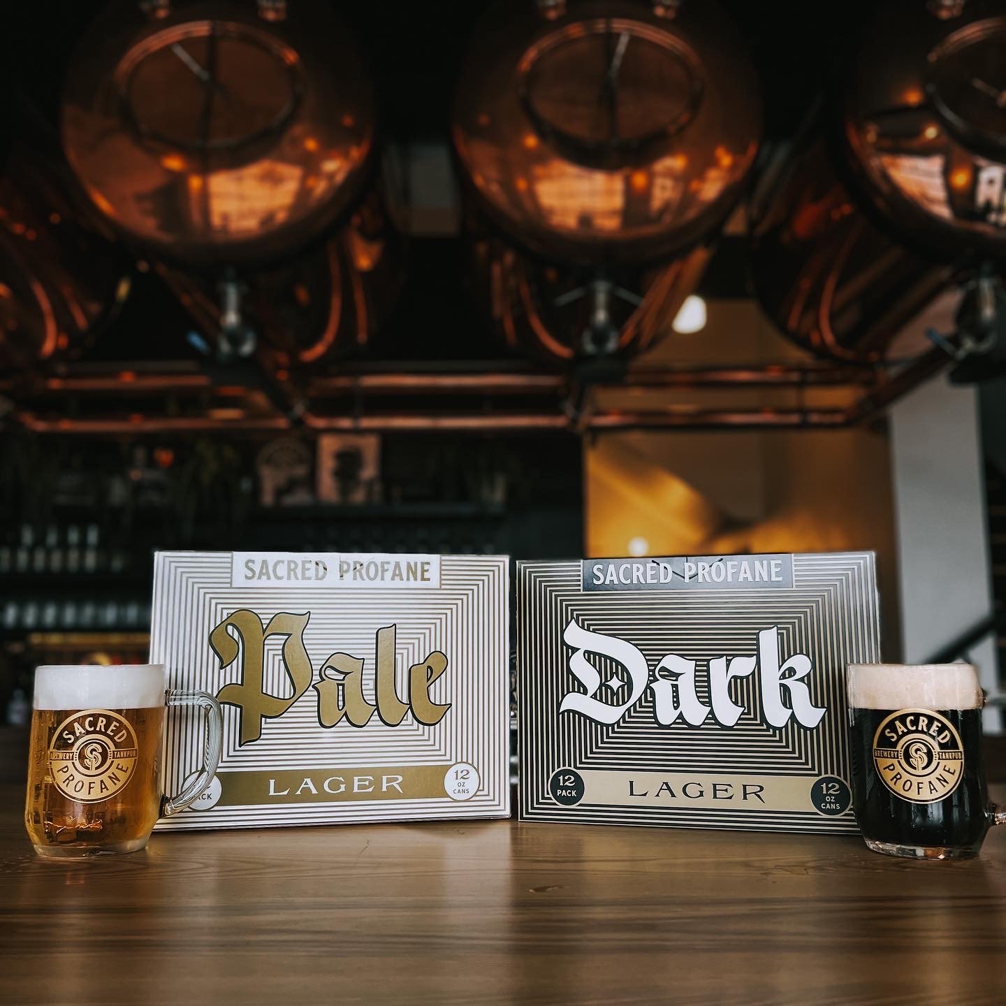
Jake Karls from Mid Day Squares has a great motto: "Friends first. Business second." That's exactly how this endeavor came to be. Four of my good friends decided to join forces and open a brewery together. Sacred Profane is radical in its simplicity, offering two kinds of beer: Dark Lager and Pale Lager. That's it.
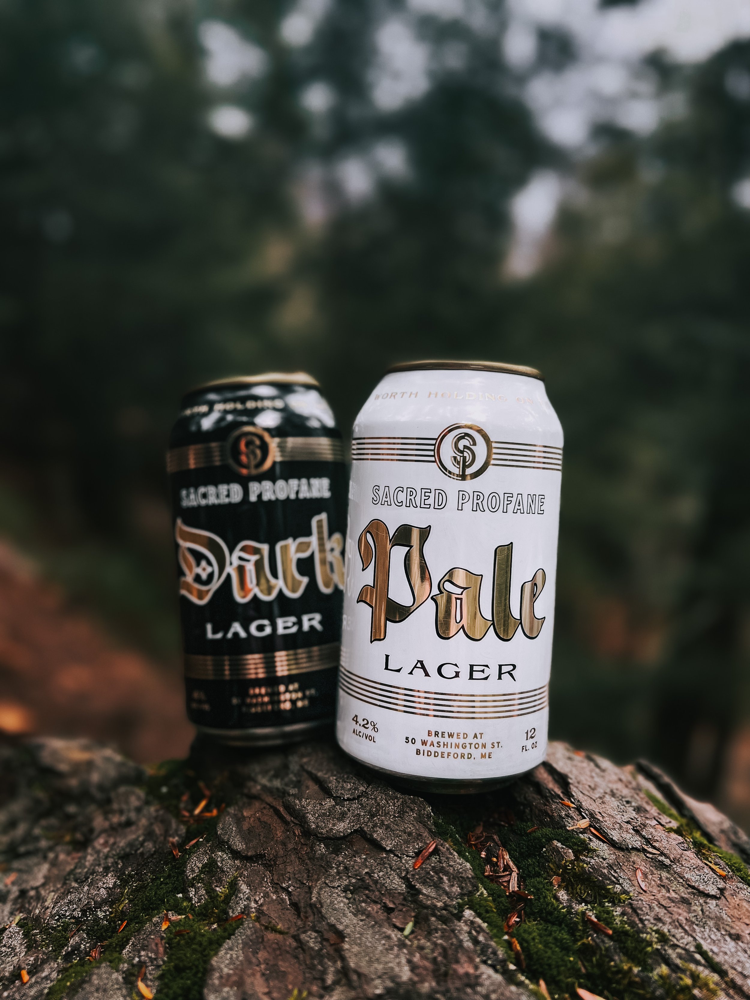
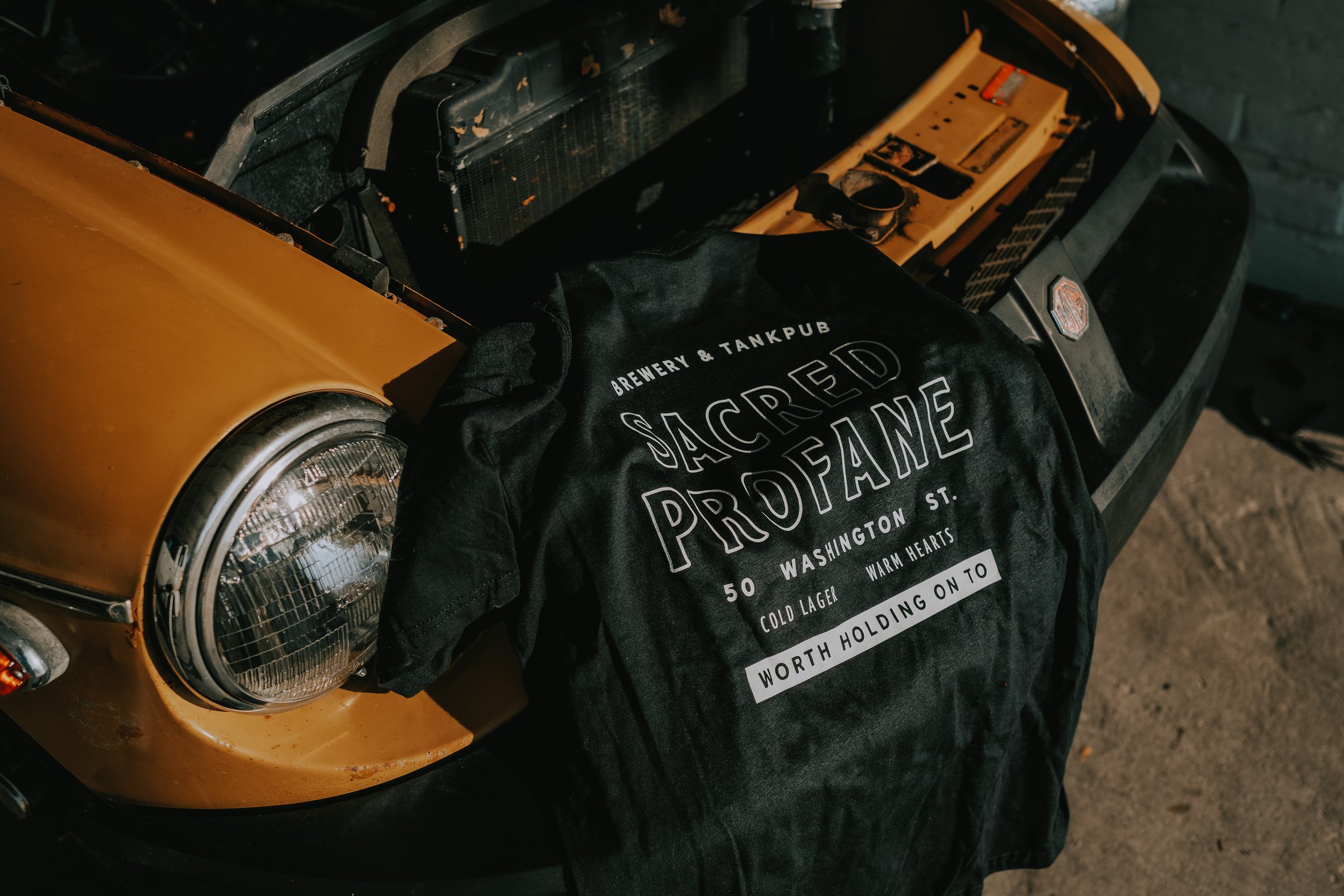
I believe that the most creative solutions often arise from significant constraints. In this case, the constraint was limiting the color palette to just three colors—black, white, and gold. I needed to develop a robust system that could be applied to cans, case boxes, t-shirts, signage, menus, and various types of merchandise.
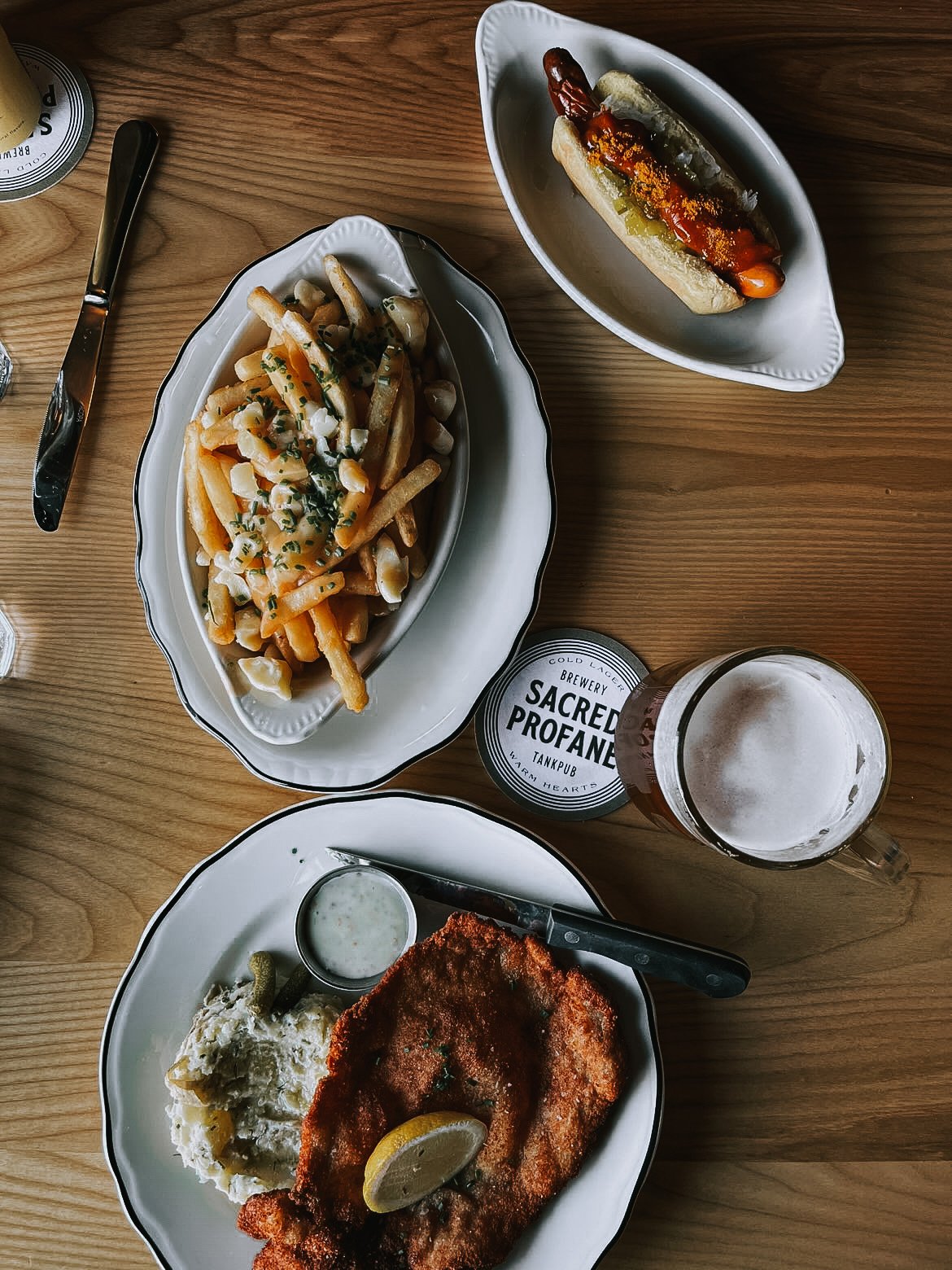
The cornerstone of this system is the logo mark and the stripes. I determined that any external aspects related to the beer beyond the brewery premises should incorporate these elements, albeit in diverse ways to maintain visual interest. On the other hand, anything within the brewery should employ typography that complements the cans, with the option to omit the stripes. As for merchandise, it's a bit of the wild west. The owners and I agreed that the merchandise should stand independently as a lifestyle brand without being solely focused on beer.
They made a significant debut with printed cans, and the strategy paid off handsomely. Their first canning run completely sold out within a single weekend. Moreover, pre-orders for the t-shirts provided a substantial income boost even before they officially opened their doors.
Brienne Allan, Head Brewer, Sacred Profane


